Winner of the first Treasure Thursday and the Adorned You giveaway is:


Congratulations Milka! Hope you can wear this ring at your ball :)
---------------------------------------------------------------------------------
Every year, around Christmas time, I’m searching calendars for a new year. Etsy offers so many beautiful calendars, but seems that I have fund my favourites. At least for the 2010.
Today’s treasure comes from three sisters. 3SistersLove is a really cute Etsy shop that sells stationery, calendars, gifts and more.
We are 3 loving sisters :)
How long have you been designing cards and calendars? How and why did you start?
The oldest sister is an artist and a graphic designer. The middle sister is a painter and a vet student. The youngest is… well… blonde with blue eyes, and she is there to inspire us and bring new ideas!
We’ve been always creative in our daily lives as well as at work. We started our Etsy journey in 2008, creating clay pendants at first. Then from there, using our skills in fine arts and graphics our designs slowly evolved from 3d clay objects to 2d paper goods.
Where do you get your inspiration for the items in your shop?
We are story tellers and get inspired from other creative people that tell stories thru their designs. For example, one of our favorite architects is I.M Pei. In his architecture every viewing angle has depth and tells a story. We think about our designs even before initial sketching phase.
We are story tellers and get inspired from other creative people that tell stories thru their designs. For example, one of our favorite architects is I.M Pei. In his architecture every viewing angle has depth and tells a story. We think about our designs even before initial sketching phase.
If you had to choose just one favorite item in your shop, what would it be and why?
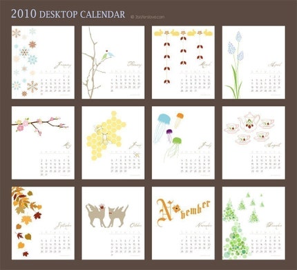
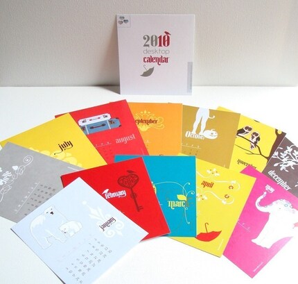
Our calendar designs are what we are really proud of. We can’t choose between Version 1 and Version 2 because they are both very special to us.
It wasn’t easy to design them as it probably looks. For both versions each month has it’s own concept. Even with different concepts we had to make sure that at the end all 12 months are unified thru color and style of that particular calendar. It’s like putting together a puzzle.
Giveaway!
3SistersLove is giving one lucky reader a 2010 Calendar. Winner can choose between Version 1 and Version 2.
Rules:
* please make sure to leave separate comment for each entry;
* in your comment, please include contact information so I can reach you;
* winner of the giveaway will be chosen next Wednesday (December 16th);
* winner has 24 hours to answer my email or new winner will be drawn.
* Giveaway is open worldwide!
Here’s how to enter:
* Mandatory entry: please visit 3SistersLove and let me know, which version of the 2010 Calendar you like most and why? (please answer to both questions)
* Extra entries:
+1 - add 3SistersLove as your favorite on Etsy (leave your Etsy username);
+5 - purchase from 3SistersLove and let me know;
+1 - follow my blog;
+2 - follow me on Twitter @MadeInCanarias and tweet this giveaway (leave your tweet link);
+2 - post about this give-away on your blog (leave a link).
*Remember to leave your contacts in the comments and leave separate comment for each entry.
Good luck!


 Treasure Thursday – 3SistersLove (giveaway) CLOSED


Hello!
ReplyDeletePlease enter me in this giveaway!
I like version 2 of the Calendar.
I like it because it is more colorful then version 1 and i really like bright and colorful things. They just stand out more. I guess thats good for a calendar.
aqua_lily13@hotmail.com
+ I follow your blog.
ReplyDelete+2 I follow you on twitter.
ReplyDeletewww.twitter.com/Mevurah
I also tweeted about this giveaway
http://twitter.com/Mevurah/status/6516175828
+2 i posted a blog entry about this giveaway.
ReplyDeletehttp://theheartofdreams.blogspot.com/2009/12/3-sister-love-giveaway.html
I really love 2010 Desktop Calendar Version 2 because the elephant is just too cute.
ReplyDeletesparklemidori09@gmail.com
I added it to my favorite on etsy
ReplyDeletesparklemidori
sparklemidori09@gmail.com
I am following your blog
ReplyDeletesparklemidori09@gmail.com
Im following you on twitter and twitted
ReplyDeletehttp://twitter.com/sparklemidori
sparklemidori09@gmail.com
1st
Im following you on twitter and twitted
ReplyDeletehttp://twitter.com/sparklemidori
sparklemidori09@gmail.com
2nd
I blogged the giveaway here
ReplyDeletehttp://free4beauty.blogspot.com/2009/12/giveaways-alert-28.html
sparklemidori09@gmail.com
1st
I blogged the giveaway here
ReplyDeletehttp://free4beauty.blogspot.com/2009/12/giveaways-alert-28.html
sparklemidori09@gmail.com
2nd
I like version 2 more because it's about color and animals and I like the art and design of it better then version1 .
ReplyDeleteAlthough version 1 has a nice tea-pot and cups on one of their months .
I added 3Sisterslove to my favorites and my name on etsy is squirrel33 .
ReplyDeleteI am a follower of your blog .
ReplyDeleteEuphoria13: +1 for following me on Twitter
ReplyDeleteEuphoria13: +1 for blogging about the giveaway.
ReplyDeleteI like version 2 the best because I love the bold colors!
ReplyDeletejinglesellsgmail.com
I added 2SistersLove as a favorite in Etsy. jinglesells@gmail.com
ReplyDeleteI follow your blog.
ReplyDeletejinglesells at gmail dot com
I like 2010 Desktop Calendar Version 1.
ReplyDeleteBecause is it more simple ... I love the simple things.
I'm a follower.
ReplyDeleteale84.vercelli@hotmail.it
I follow on twitter and I tweet.
ReplyDeleteale84.vercelli@hotmail.it
http://twitter.com/dakha
#1
I follow on twitter and I tweet.
ReplyDeleteale84.vercelli@hotmail.it
http://twitter.com/dakha
#2
I added your candy on my blog:
ReplyDeletehttp://ecobetsabea.blogspot.com/2009/12/made-in-canarias-candy.html
ale84.vercelli@hotmail.it
#1
I added your candy on my blog:
ReplyDeletehttp://ecobetsabea.blogspot.com/2009/12/made-in-canarias-candy.html
ale84.vercelli@hotmail.it
#2
Loving Version 2. Why? Because of the use of colours as well as the cool pictures. Love the use of animals and other meaningful things in life.
ReplyDeleteThanks for the giveaway!
reviewsbyabby at gmail dot com
It's Version 2 for me. Version 1 is quite festive in my opinion and while that isn't a bad thing, it looks a little plainer than Version 2 which is so vibrant and cool!
ReplyDeleteshiki6210 at gmail dot com
I like version 1!
ReplyDeleteGreat give away :)
audreyscountrycrafts at gmail dot com
I have added the shop as a favorite on Etsy:
ReplyDeleteaudreyscountrycrafts
audreyscountrycrafts at gmail dot ocm
I would love version 1. It strikes me as organic, modern, and feminine, all of which I've been drawn to lately.
ReplyDeletenicole[dot]mckee08[at]gmail[dot]com
I've added 3sisterslove as a favorite on Etsy.
ReplyDeleteEtsy username: nslods
nicole[dot]mckee08[at]gmail[dot]com
i love version 1 because it is so light and would match perfectly in my office! thank you!
ReplyDeletemaria.dalessandro@gmail.com
I like version 1 because I love the clean white background and it would match better in my office.
ReplyDeleteThank you for the giveaway :)
hurdler4eva(at)gmail(dot)com
Great giveaway! I love Version #1 the best. It suits my personality and I love the neutral colors.. very pleasing to the eye :)
ReplyDeleteseasidesmitten@aol.com
I added 3sisterslove as my favorites on Etsy as well as the calendar as a favorite :)
ReplyDeleteSeasidesmitten@aol.com
I follow your blog :)
ReplyDeleteSeasidesmitten@aol.com
I like version 1 because of its simplicity and modern designs.
ReplyDeleteadamsblankie@gmail.com
added 3sisterloves as favorite on etsy
ReplyDeleteetsy id - adamsblankie
adamsblankie@gmail.com
i follow your blog!
ReplyDeleteadamsblankie@gmail.com
i love version #1 because the bees remind me of pushing daisies!
ReplyDeleteLmhoot@flash.net
i tweeted: http://twitter.com/slowclublover/status/6570934447
ReplyDeleteLmhoot@flash.net
i blogged: http://someoneinbetwixtofmeandyou.blogspot.com/2009/12/2010-soon.html
ReplyDeleteLmhoot@flash.net
Beautiful calendars I like version 2.Thanks for the great giveaway.
ReplyDeleteHelen
malfie@care2.com
Lily: +1 for blogging
ReplyDeleteI live version2...the colors appealed to me! Thanks!
ReplyDeletepicnut1512@yahoo.com
i like this calendar the best & like the simple white background & line drawings :)
ReplyDeletejudybloomflowers@hotmail.com
http://www.etsy.com/view_listing.php?listing_id=36228962
i blogged about it :)
ReplyDeletehttp://missymissmisc.blogspot.com/2009/12/calendar-giveaway.html
please enter me again!
judybloomflowers@hotmail.com
Miss Judy Bloo: +1 for blogging
ReplyDeleteI like the version 1 calendar for it's clean white design
ReplyDeleteMelissa
www.lissylee77.etsy.com
I love version 1 better; I like the subtle colors better, and it has jellyfish. I like jellyfish.
ReplyDeleteurchiken at gmail dot com
It's hard to decide. I like the first one because the designs are more uniform, but the second calendar has great color which would brighten up any workspace. I think I may have to go with #1.
ReplyDeletethe_outsider01AThotmailDOTcom
I love Version 2, colors are lively and fun, thank you.
ReplyDeleteyumihamano@gmail.com
I would most like to win the Version 1 calendar. To be honest, both versions are absolutely adorable, but I think my mom would like the animal and nature illustrations of V.1 the best!
ReplyDeleteI like the polar bear calendar best. The color is so soft and tranquil, the bears are so cute, and its really beautifully designed.
ReplyDeletehttp://www.etsy.com/view_listing.php?listing_id=35147189
Ronit
internationalgiveaways[at]gmail[dot]com
http://internationalgiveaways.blogspot.comu
I posted about this awesome giveaway in my blog! Here's the link:
ReplyDeletehttp://internationalgiveaways.blogspot.com/2009/12/calendar-from-3sisterslove.html
Ronit
internationalgiveaways[at]gmail[dot]com
http://internationalgiveaways.blogspot.com
I blogged about this awesome giveaway! (entry #2) Here's the link:
ReplyDeletehttp://internationalgiveaways.blogspot.com/2009/12/calendar-from-3sisterslove.html
Ronit
internationalgiveaways[at]gmail[dot]com
http://internationalgiveaways.blogspot.com
I like Version 2 better - because the colors are brighter and more cheerful. Very cute!!
ReplyDeletemandm_2002 at hotmail dot com
I think they are both great but my favourite would have to be Version 1 as I like the white - so elegant.
ReplyDeleteI follow your blog :)
ReplyDeleteI love version one so much! I love how simple it is, and how sweet the little designs are -- very organic, very nature-y: perfect for me! :)
ReplyDeletetheonlinenannyATgmailDOTcom
They're both beautiful but I love version 1 the most as it is more in the style of my home decor!
ReplyDeletedebyeo@hotmail.com
I have hearted 3SistersLove on Etsy (dspdavey).
ReplyDeletedebyeo@hotmail.com
I follow Made In Canarias on Twitter (dspdavey).
ReplyDeletedebyeo@hotmail.com
I like version 1 of the 2010 calendar
ReplyDeletefollowing blog
ReplyDeleteI like the 2010 Desktop Calendar Version 1 better because the design is simple.
ReplyDelete2010 Desktop Calendar Version 1
Hearted the shop. (bloomingblossom)
ReplyDeleteaikychien at yahoo dot com
I'm a follower.
ReplyDeleteaikychien at yahoo dot com
Follow @aikchien and tweeted:
ReplyDeletehttp://twitter.com/aikchien/status/6649860059
aikychien at yahoo dot com
Follow @aikchien and tweeted:
ReplyDeletehttp://twitter.com/aikchien/status/6649860059
aikychien at yahoo dot com
I like version 2 best because i like the monthly corresponding colors!
ReplyDeletetazimd@gmail . com
I like version 2 because I love bold colors!
ReplyDeleteorangegirl779@hotmail.com
These notecards are so cute...
ReplyDeletehttp://www.etsy.com/view_listing.php?listing_id=33809435
and I like version 1, ambrerose@aol.com
My favourite is the 2010 Desktop Calendar Version 2 here: http://www.etsy.com/view_listing.php?listing_id=35167109
ReplyDeleteI like the idea of exchanging cards, and also the design of September:)
spamscape [at] gmail [dot] com
+1 I'm also your blog follower via Google Friend connect.
ReplyDeletespamscape [at] gmail [dot] com
I like version 1, because it has a more feminine design to it and i love the colorful drawings on a white background.
ReplyDeleteyuri.kristi at gmail
i hearted it on etsy (id 2thousandthings).
ReplyDeleteyuri.kristi at gmail
i follow your blog!
ReplyDeleteyuri.kristi at gmail dotcom
I like both versions and at first I was going to say 1 because it looks like the dates are easier to read, but I mean, if you're not really going to write on it now I'd have to say version 2, more bright colours make it look more like a work of art from farther away and would really pop in a kitchen!
ReplyDeletePerfectbluemoon@gmail.com
love Version 2 bc it would suit our bedroom better!
ReplyDeletefollow blog
ReplyDeleteThe calendars are beautiful. I like Version 2 for its vibrant colors and images, but I love Version 1 more. :) Version 1 has a calming effect for me. The white background exudes a relaxed and "clear-minded" feel, which is good for my busy and colorful days. ;)
ReplyDeleteThanks for having this wonderful giveaway!
dalilasmzubir[at]gmail[dot]com
I like Version 1 because it's pretty. The other is lovely as well, of course, but I like the trees on Version 1.
ReplyDeleteThanks!
h4schaffer at gmail dot com
I like version 2 better, because it's brighter and more fun. Version one is classy, but looks simple. I like pizazz! :)
ReplyDeletezairabear@gmail.com
I follow your blog!
ReplyDeletezairabear@gmail.com
Hi, I loved both calendars, but think I would choose Version 1. I love the colors on 2 but the Version 1 is very elegant and calming. Thank you,
ReplyDeleteSusan
Although I do love both versions, I like the 2010 Desktop Calendar Version 1 more. It's much more delicate & serene. =)
ReplyDeletetylerpants(at)gmail.com
I follow your blog!
ReplyDeletetylerpants(at)gmail.com
hearted on etsy (vaverine)
ReplyDeletevaverine at yahoo dot com
This is a hard one. I think I like the designs on Version 1 slightly more (being a bee nut), but the colour punches on Version 2 have got to be the winner in my mind. I would love to have that vibrancy on my desk every day!
ReplyDeletevaverine at yahoo dot com
I definitely love version one - its more me, minimalist and simple, modern and clean.
ReplyDeletepaperaffection.etsy.com
and I hearted their shop! :)
ReplyDeletepaperaffection.etsy.com
Deb: +1 for following me on Twitter
ReplyDelete